WHITE LABEL MOBILE AND TABLET BANKING APPLICATION
Simplicity and intuition are merged together in order to provide an easy and happy day to day experience while engaing with financial acitivites.
SERVICES
- Best practice research
- Persona creation
- Wireframes
- Wireframe
- Prototype
- User testing
- Design
TEAM
- dr. András Rung – UX lead
- Maria Amidi Nouri – UX architect
- Made by zweolf – UI design
(Android phone and tablet)
In September 2015 W.UP a banking software developer requested to build a white label, native mobile banking application tailored for iOS and Android platforms.The goal was to provide a seamless banking experience while interacting with the most common and core banking services.
Our strategy shaped by forming the design principles:
Frequency of usage
- Emphasis on features that are used generally in order for the users to find what they are really looking for
- More frequently used features are the most prominent
Using all the time the cheapest interaction (mental and physical cost)
We want the users to have the highest level of engagement and thereby we put a lot of effort into simplifying the interactions and the layouts showing the necessary minimum in every context.
Item related actions and navigation
Whenever an item can trigger a meaningful action we place it at the appropriate place.
Flat structure
- Navigation kept on minimum
- Content is in focus
Aesthetics by design not by elements
- Graphs are good only if they are meaningful
- Pictures are used when they provide context or information
Information architecture
- Importance of the content is emphasised by colour and size
- Promotions are seamless intending to make easier usage, presented as background information
Subsequently we performed a best practice survey specialising on the topic to ensure the implementation of the latest trends.
After defining the strategy we inferred 3 personas that could represent the future users of the app, concentrating on their behaviour usage such as financial knowledge and openness for proactivity and advices as well as their income and potential earnings.
Taking into consideration the 3 Personas along with the relative learning capabilities of the users, we came up with the main characteristics of the key screens:
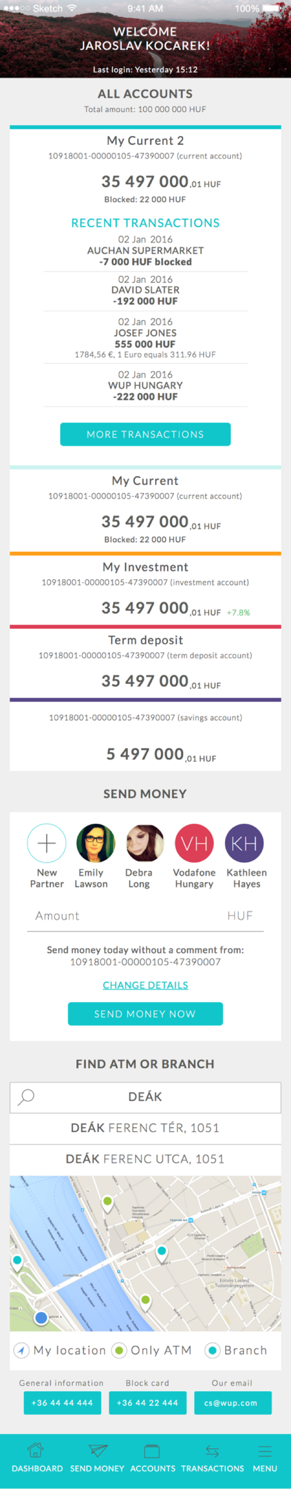
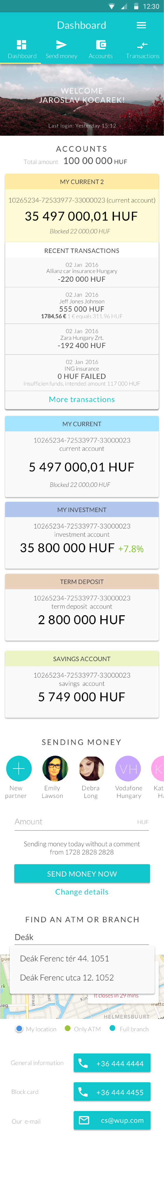
Dashboard
- The accounts are personalized in a way to show you the relevant content
- 3-5 transactions of the favourite/default account are shown
- The fluctuation of the investment account(s) is shown
- Partners are sorted by frequency of sending money to them
- Find ATM or branch precedes the ‘Sending money’ section for users who use that function more often
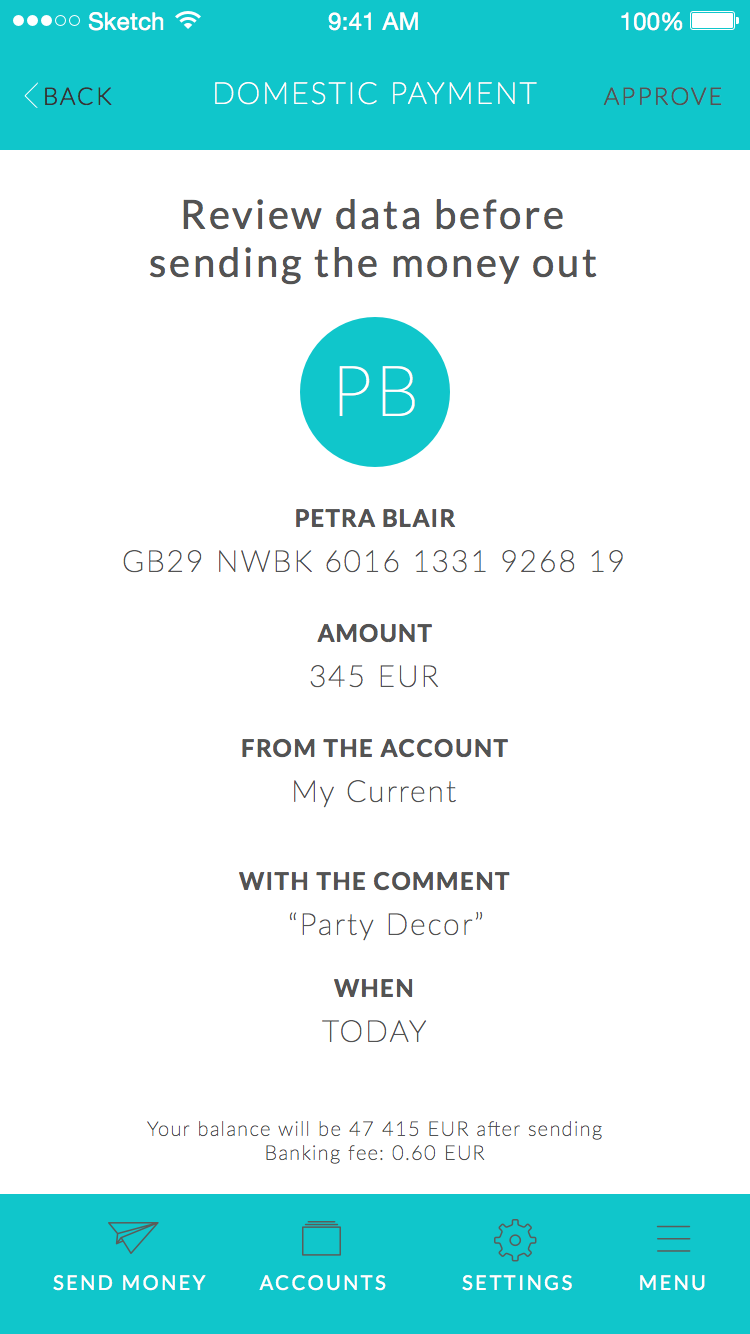
Showing only the required information, emphasising on maintaining the primary information at the middle and showing the secondary information on the sides with icons in a symmetrical and visual order.
The colour and size representation of the amounts is based on the fact that in many cases readability precedes usability, the goal is to find the desired information as fast and easy as possible without getting confused and lost in the screen. This screen reflects the simplicity while having a neat structure.
Each transaction can be repeated by swiping from right to left on that transaction. By this gesture user can easily do the same transaction without having to start the whole process from scratch.
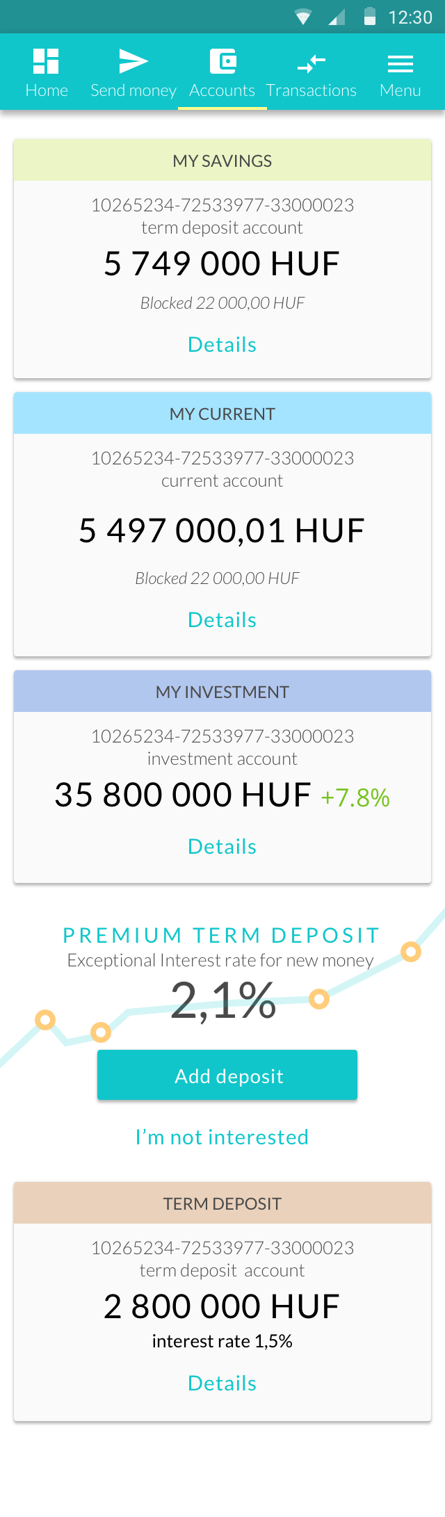
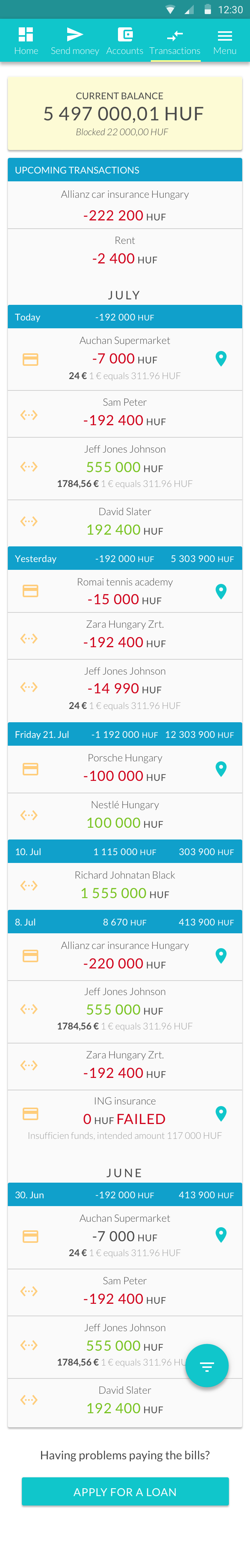
- The accounts are ordered by the number of monthly transactions carried out on them
- Tailored promotion offer for each user relevant to their financial state and usage
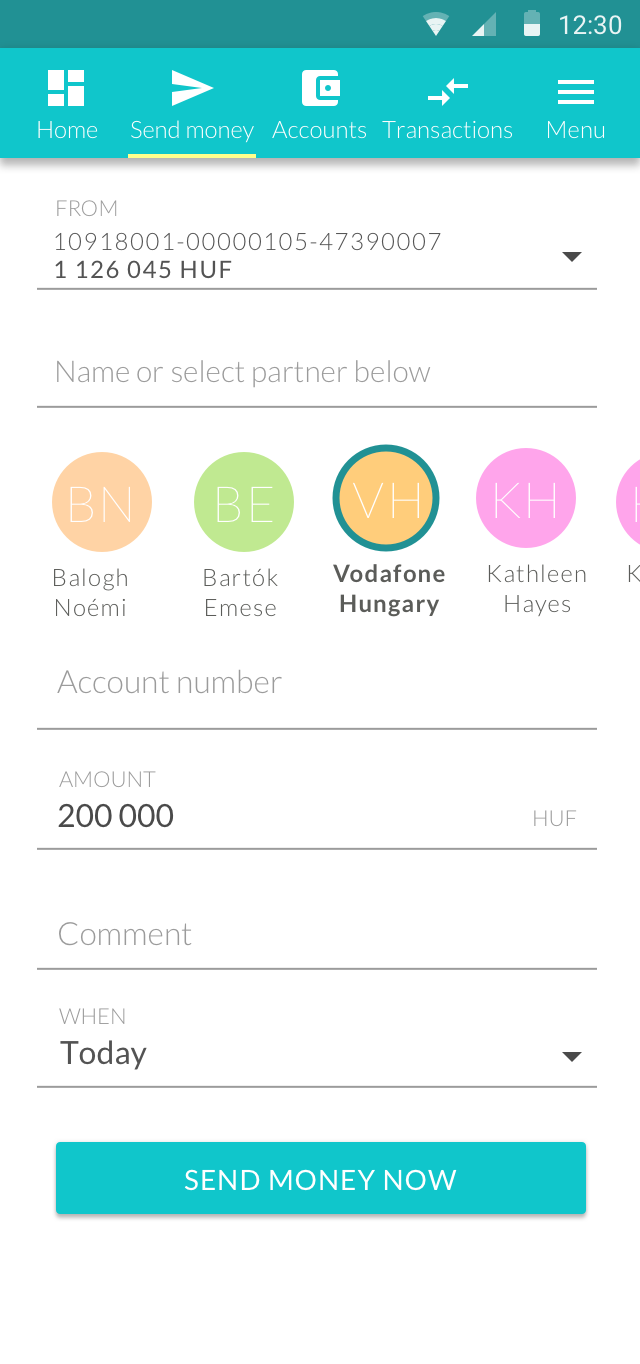
- Partners are sorted by frequency of sending money
- Account most commonly used for transaction is preselected except if the user is coming from the open card (account list) of an account
If user does not go back from preview screen to modify something for 3 months, we promote the transfer without preview under 50 Euros
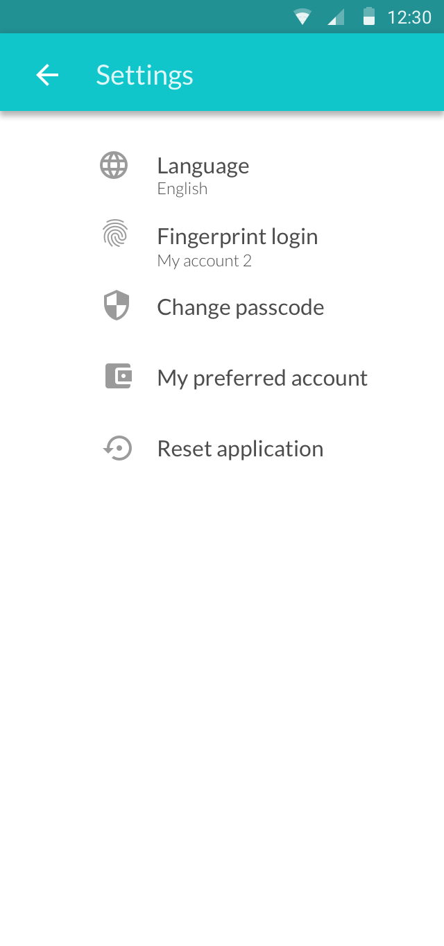
Mainly for essential modifications without overcrowding the screen, main action are:
- Enable and disable fingerprint login
- Change passcode
- Phone numbers, email for contact
User testing
Heavy user testing was carried out with approximately 30 potential users in all the platforms for mobile and tablet to get a validation for the proposed design and see whether users are able to interact with the application or not. We closely observed what kind of difficulties the participants were facing and what are the tasks which require the most effort along with their expectations of a banking application.
Afterwards we analysed the test results carefully and made the necessary iterations on the designs and continued to fine-tune all the delicate details.
Through out the whole process; from kick off till execution we kept regulars status meetings with the design team and W.UP to make sure that all is aligned and on track.
Future ideas
Send money
- Users who do not comment and don’t use the ‘when’ option at least once a year, the relating fields could be hidden but staying accessible for ad hoc usage
Settings
- Transfer without preview for small amounts (under 50 euros)
- Remove a partner
- Define preferred account for displaying it first
- Define preferred account for transfers
Banks using the app
MKB Bank requested to customise the app for their business and finance purposes, you can see the results by the following links:
https://play.google.com/store/apps/details?id=hu.mkb.mobilapp&hl=hu
https://itunes.apple.com/hu/app/mkb-mobilalkalmaz%C3%A1s/id1119170162?mt=8
We participated in the implementation of all the goals and requirements which the Bank requested in the white label app and ensured it by having meetings and continuous close communication throughout the customization.
Budapest Bank found the application suitable for their banking goals and clients’ needs as well, hence they have refined it and launched their new app.